The (not so) omnipotent artboards
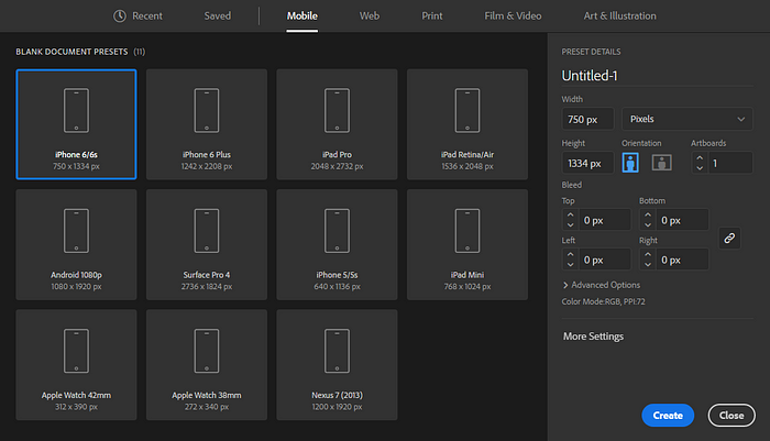
We designers love artboards. From rough UI sketches to high fidelity mockups, we see ourselves as visual artists expressing ideas on artboards that have a pre-defined width and height. To start a new project, we declare the size of the artboard in the first step.

Configuring artboards for a new project in Adobe Illustrator
Want about responsive design? Not a problem! We diligently design on three artboards — one for mobile, one for tablet, and one for desktop — with content elegantly adapting, scaling, reflowing, reordering, and reprioritizing. We proudly hand off the artboards to developers while patting ourselves on the back: this is how responsive design should be done.
After weeks of arduous engineering, the product finally comes out. We find, to our great dismay, that some copy is hanging off the grid, the focal point of the hero image has been cropped out, the font sizes don’t even come close to the type ramp. What went wrong? Can’t the developers just see everything on all those artboards?
Nope.
Lossless handoffs in other industries
To understand the problem with artboards, let’s first look at the handoffs between designers and engineers in other industries. Architects hand off blueprints to developers. Book authors hand off drafts to publishers. Musicians hand off soundtracks to mastering engineers. Of course, these are over-simplified views of how handoffs actually work in the building, publishing, and music industry, but they all illustrate the same principle: the designers record their creation in some intermediate format that the engineers can later reconstruct faithfully in the production format.
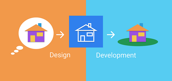
The engineers can faithfully reconstruct the creation because the intermediate formats — blueprints in CAD files; texts in a PDF files; soundtracks in a WAV files — are lossless. A lossless format captures the creation with as much fidelity as it takes to completely reconstruct the creation in the final format — buildings in wood, glass, and concrete; books in ink and paper; music on LPs and CDs— all the questions that an engineer could ask about the original creation have already been answered by the intermediate format.

The development outcome matches the initial design because the intermediate format is lossless
Artboards as a lossy format
Back to UI/UX design. When we export the high fidelity mockups and redlines to developers, we are using artboards as the intermediate format to record our creation, and expect the engineers to faithfully reconstruct our creation in the final format: the browser. But between the artboards and browser, there is a glaring gap.
No matter how many screen sizes our artboards account for, some user’s browser will break loose from our prescription. With users resizing, rotating, and zooming the screen, new devices stretching, squashing, curving, and cutting (e.g. the speaker area in iPhone X) the screen, the sizes become infinite. Good luck making an artboard for each one of them.
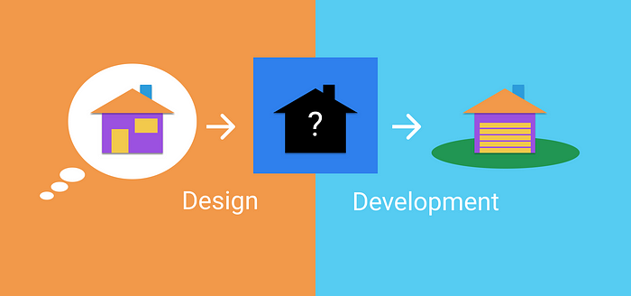
Artboards are a lossy format. Using artboards in a handoff is a lossy process. When we pitch a finite number of plans against an infinite number of situations. We inevitably get in-betweens. Once there are in-betweens, there are unknowns. Once there are unknowns there is guesswork. Once there is guesswork, there are surprises. Engineers take the path of least resistance. We are ones who paved the path.

The development outcome distorts the initial design because the intermediate format is lossy
Source of ambiguity
Artboards not only leave gaps on the spectrum of screen sizes, but also causes ambiguity about content structure. Browsers, the final format of production, demand content be to organized in a tree structure. Any visual element on the screen belongs to some parent element, and can have siblings and children. The artboards, on the other hand, is inherently flat. When engineers reconstruct a content tree from our flat artboards, multiple possibilities for content structure arise. In the old days, developers could simply pick a plausible content structure and build the desired appearance with lots of CSS hacks. But no facades can hide the crap underneath. When our clients demanded inclusive and responsive designs, the content reflew to the wrong place upon resizing because it was coded under the wrong parent, and the screen reader skipped some header because the document outline, inferred from the underlying HTML, was incorrect. Built on the wrong content structure and overfitting to some specific visual style, even the gentlest shake from new requirements brought these facades to ruins.

Content structure is lost when recorded on artboards
Sadly, with no experience in information architecture, and no hint of content structure from those lossy artboards, developers were forced to shoot arrows in the dark. A lossless handoff could have saved the day.
A solution that already exists
If artboards are lossy, what does that leave for design-development handoffs? The solution already exists. Simply hand off designs in the same format that the final production uses: HTML and CSS, maybe with a sprinkle of JavaScript.
HTML+CSS+JavaScript in browsers is a lossless format with many benefits:
- With HTML comes content structure. Developers won’t have to guess if some title X describes the first paragraph or the entire section. Reflows are always correct. Screen reader announcements are always accurate.
- Browser is the natural habitat for HTML and CSS. All environment conditions can be easily simulated and tested by anyone involved in the process. No more surprises with viewport sizes, screen rotation, high contrast mode, font zooming, etc.
- Browsers are the best free CSS property inspectors. There is no need for adding measurements, color codes, font families to the redline. You might even get rid of high fidelity mockups completely! There is no overhead in setting up and paying for services such as InVision and Avocode to let developers inspect the code. The design is the code.
- Not all designs are feasible. If a design cannot be captured with code at an early stage, it probably won’t be easy to build and maintain in production environment later. Testing the feasibility at the design stage informs project management and ultimately reduces cost.
Until we get there
Coding isn’t for everybody. Whether it’s an all-star startup team, a small design agency or an in-house design team within a large enterprise, someone will still depend on the lossy handoffs. You might even appall your stakeholders by proposing handing off code running in browsers as opposed to the familiar mockups on artboards. But there is a lot we can do now to facilitate the adoption of lossless handoffs:
- As a designer, learn writing HTML, or better still, semantic HTML. If coding up the entire design is too hard, try coding up one component at a time, and not worrying about CSS. The HTML alone will prove invaluable for developers to understand the content structure. In addition, you are forced to optimize the information architecture as you work out the code from content.
- If coding by yourself is out of the question, pair up with the engineer who will receive the design. Work closely with him or her to prototype the design, validate responsive behaviors, and obtain feedback on the feasibility. Don’t call it an iteration until the design has seen played with in code.
- As a manager for large enterprise, co-locate your designers and developers, encourage interdisciplinary learning, understand that each minute spent on coding before the handoff translates to ten minutes saved from changing and fixing issues after the handoff.
- As a stakeholder in the handoff meeting, give the designer a thumbs-up when he or she demos live code running in browsers in place of mockups on artboards. That’s a design champion you are looking at.
Your voice matters
If you are also frustrated with the lossy design-development handoff, you can join the pursuit of the lossless alternative by simply sharing this article with your colleagues. I would also like to hear your opinions, suggestions, and stories about design-development handoffs. Your voice matters.